Normally, I analyze basketball data. But these are not normal times, and I wanted to see if there was anything I could do to help. This article is an attempt.
When we talk about statistical analysis in sports, I’m a big believer in the importance of domain knowledge in performing any analysis. The same holds true here. So I want to be clear: I am not a domain expert in this field. I have never worked with health data before. I have tried to test and validate my conclusions as I would any data, but I certainly could have blind spots, and without domain knowledge be blind even to what those blind spots are.
If you do have domain knowledge and spot an error, please email me at ben@cleaningtheglass.com or contact me on Twitter @bencfalk.
In the fight against COVID-19, there is one key theme that continues to emerge. To have a chance, we have to be able to see what we’re fighting. That’s why the head of the World Health Organization, Tedros Adhanom Ghebreyesus, said recently: “Our key message is: test, test, test…it is not possible to fight a fire blindfolded.” Similarly, Balaji Srinivasan has pointed out that the way out of a prolonged lockdown has to start with testing:
To reiterate, lockdown without scaled testing will not achieve desired ends.
1) Virus is invisible
2) Testing makes it visible
3) Use gradation of tests: thermometer, CT, PCR
4) Identify red & green zones, with high & low virus %
5) Let people in green zones out of lockdown https://t.co/V4OB58bVFD— Balaji S. Srinivasan (@balajis) March 20, 2020
That Washington was the first state that started to mobilize against COVID-19 is not a coincidence. It was a result of the fact that they had some of the earliest testing in the country, a product of researchers who found a way around the testing restrictions.
There are still plenty of obstacles in the way of scaling the kind of testing we need. But there might be a way to at least better direct our efforts: using the CDC’s flu surveillance system’s reports of “influenza like illness” as an indicator.
Others have written about this syndromic surveillance data, mostly focusing on New York City, since their EpiQuery system is public and regularly updated. Dr. Dan Weinberger from the Public Health Modeling Unit and Department of Epidemiology of Microbial Diseases at Yale School of Public Health, published a set of graphs showing the abnormality of the spike of cases in New York City. Gahlord Dewald, on his site Thought Faucet, also dove into this data and showed that it seems to be reflecting a COVID-19 outbreak.
Both Weinberger and Dewald look at the rate of visits to New York City’s emergency departments where patients describe symptoms similar to the flu, and suggest that it tracks what we’d expect if many of these cases were actually due to COVID-19.
I believe this same analysis can be applied to the CDC’s ILINet, their countrywide surveillance system for influenza like illness (ILI).
Information on outpatient visits to health care providers for influenza-like illness is collected through the U.S. Outpatient Influenza-like Illness Surveillance Network (ILINet). Each week, approximately 2,600 outpatient healthcare providers around the country report data to CDC on the total number of patients seen for any reason and the number of those patients with influenza-like illness (ILI) by age group…
ILI is defined as fever (temperature of 100°F [37.8°C] or greater) and a cough and/or a sore throat without a known cause other than influenza.
The symptoms of COVID-19 have significant overlap with those of influenza. So if we have a net that is catching any patients with those symptoms, it’s pretty likely COVID-19 patients are reflected in that data.
Helpfully, the CDC’s flu report provides downloadable versions of certain sets of the data. Unfortunately, unlike EpiQuery, ILINet stats only seem to be updated on the CDC’s site on the Friday after the week in question. That is, I’m writing this today, March 20th, because they finally posted the data for the end of what they call “week 11”, the week ending March 14th.
But after examining the data, I think there are reasons to trust it. First, the CDC itself notes that: “The largest increases in ILI activity occurred in areas of the country where COVID-19 is most prevalent. More people may be seeking care for respiratory illness than usual at this time.” They write that to suggest not to trust this data as indication of flu outbreaks. But it’s helpful to know that in their analysis, they believe it is correlated geographically with COVID-19 outbreaks. (And we can see this by doing our own analysis—stay tuned.)
Additionally, both the EpiQuery data and the CDC data follow the reported age trends that we would expect from COVID-19: the increases in ILI reports are much lower amongst children. Here is the increase of percentage of ILI visits in each age group as compared to two weeks ago, nationally:
| Age | Increase WK9 to WK11 |
|---|---|
| 0-4 | +7.6% |
| 5-24 | +14.4% |
| 25-49 | +44.8% |
| 50-64 | +47.4% |
| 65+ | +41.1% |
Patients under 24 have only seen a slight increase compared to the massive jumps in ILI visits over the age of 24.
This data goes back to 2010. There have only been two weeks in that time where the national numbers have gone up by at least 20% in the three oldest age brackets while going up less than 20% in the two youngest age brackets. In other words, the week by week changes are usually correlated across age groups. That it’s not in this case lends further weight to the idea that the increase is capturing COVID-19 rather than the flu.
Additionally, these last two weeks show a spike in a way we haven’t before seen in flu seasons: a third peak. Nationally, flu numbers rose toward the end of 2019, then fell, then rose again, then fell. As you can see from the graph below, after that second peak we would have expected a drop off. But instead we’re seeing a third spike:
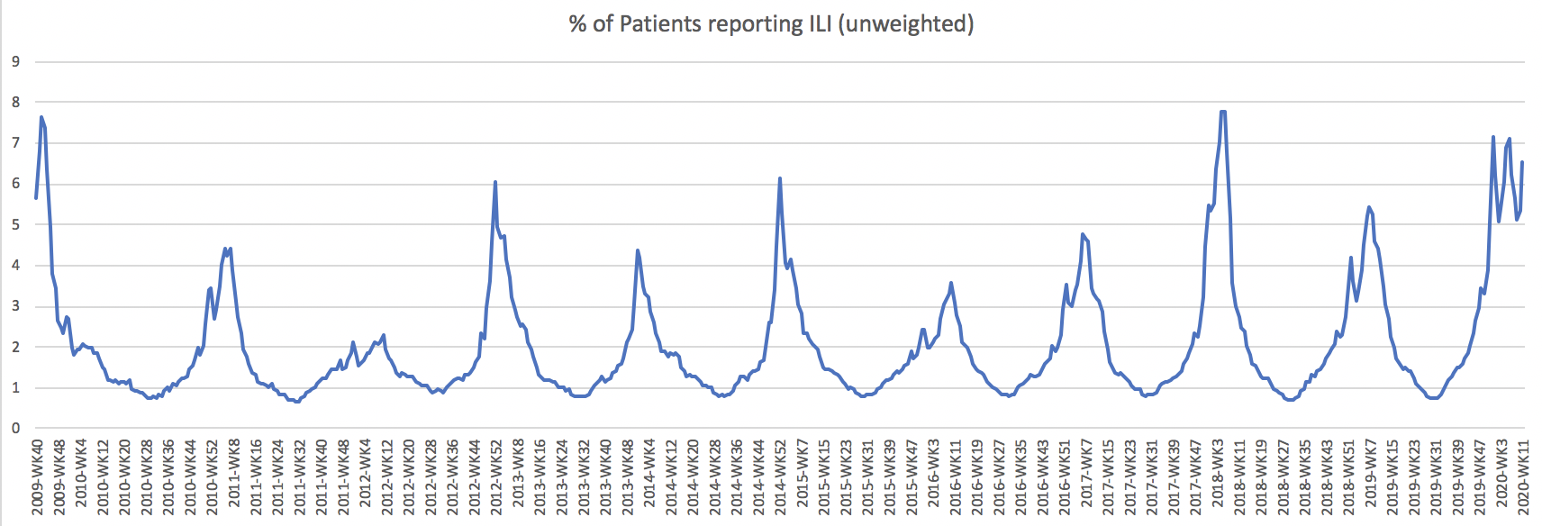
In a few states, the sharpness of this spike is as high as we’ve observed since the data began to be collected. New York City, New York state (outside of New York City), and New Jersey, for example, all show their biggest reversals of trend lines since 2010.
Lastly, according to the CDC’s numbers, while all of this is happening, reported positive tests of the flu itself are going down. Here is the CDC’s graph of positive influenza tests for this flu season:
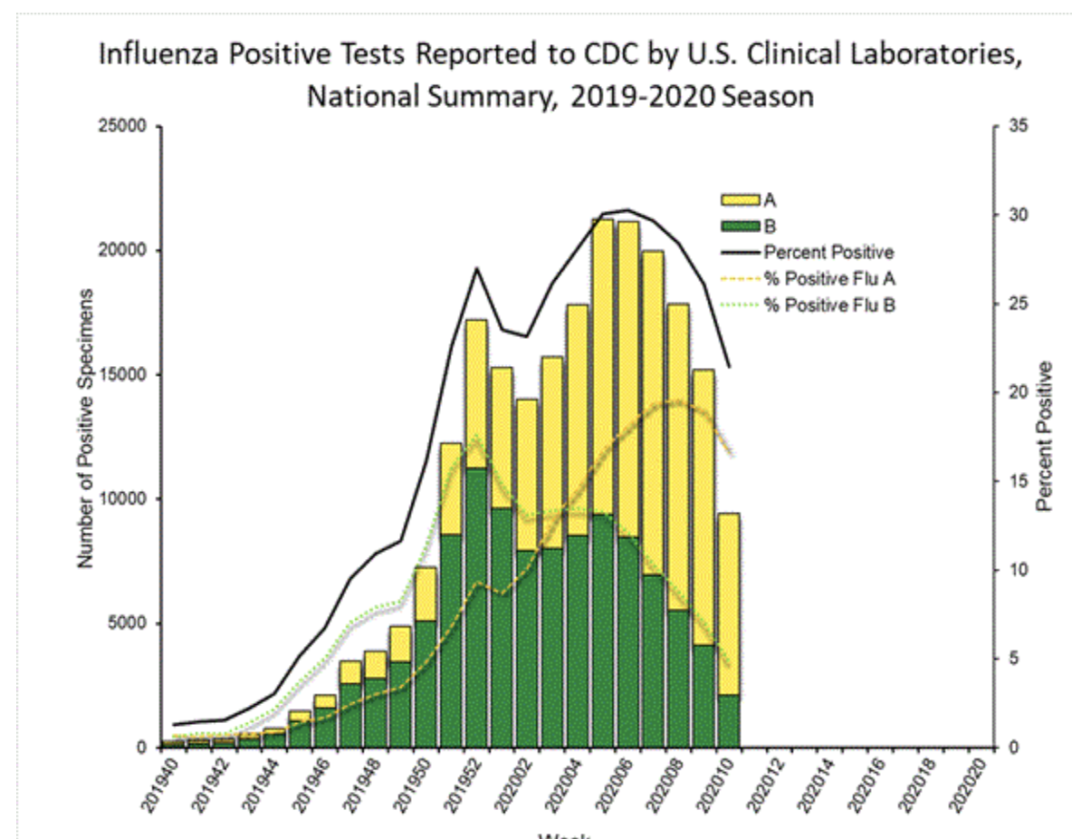
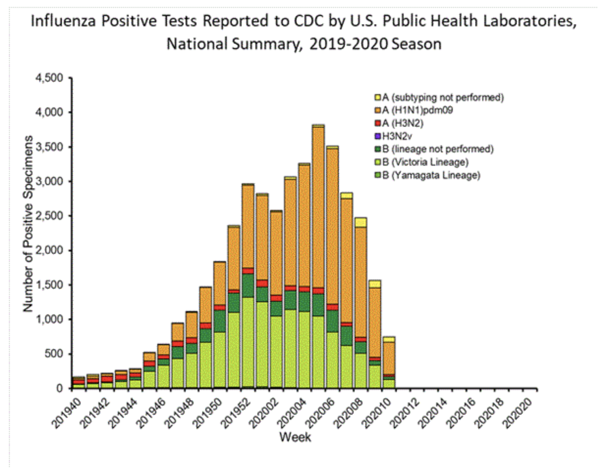
Notice that the two peaks are in there, but there’s no third peak. Positive rates of the flu have gone down while ILI has shot up.
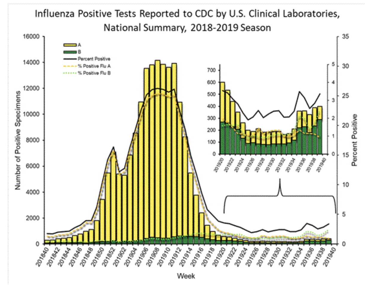
You can see how the same graph looked last flu season. We had a double peak, which the flu tests tracked, and then a sharp decline:
Now, this data comes with some caveats. First, the full data might not be in yet from some states—the number of reported providers in some of the data is down significantly from last week, suggesting the CDC (or the states) take some time to fully update their numbers.
And more importantly, these numbers are based on patient behavior. It’s possible that with so much in the news about coronavirus, patients are just much more likely to seek care for flu-like symptoms when in the past they may have stayed home. The age splits might argue against that, but it’s still possible that because the news has emphasized the age effects of COVID-19 that has impacted patient behavior.
But I don’t think we can say that’s fully the cause of these numbers, because of the state-level data. The news coverage of COVID-19 has been national, but the increases in ILI visits are far from universal. If those increases were solely an artifact of heightened awareness, I would expect those increases to be spread more evenly. For example, if it’s just a matter of patient behavior changing, why are the numbers up so much in Tennessee and South Carolina but not nearly as much in North Carolina or Kentucky or Ohio?
We can try to adjust for this by looking at a baseline national increase and see who is spiking above the baseline. For example, nationally the rate of ILI vists is up 27% between week 9 and week 11, while NYC has reported a 94% increase and Washington state a 54% increase over those two weeks. That suggests there is some signal in the NYC and Washington data—especially because we know that those places both have coronavirus outbreaks.
So what can we learn from the ILINet data that we didn’t already know? My main takeaway is that there are a few states that have not received much coverage for potential outbreaks, but which the ILI data suggests may be experiencing them. In particular, I would highlight Georgia, Colorado, South Carolina, and Tennessee.
Georgia’s ILI visits increased 76% from week 9 to week 11, after showing five straight weeks of decline. Colorado’s went up 40% after four straight weeks of decline, South Carolina’s went up 30% after four straight weeks of decline, and Tennessee shows a similar story, up 29% after four weeks of decline. Those aren’t quite at the rates of New York City (+94%), New York state (+64%) or New Jersey (+69%) where there are known outbreaks, but they’re still high relative to most other states, without nearly the amount of attention.
Lastly, Florida’s data is not included in ILINet, but their state Department of Health week 11 flu report shows a similarly alarming trend:
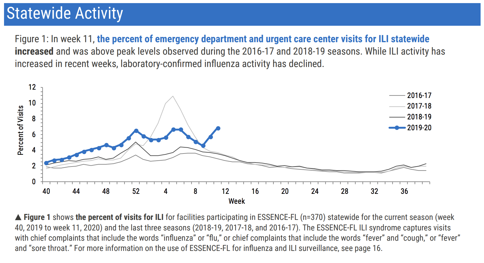
Florida has seen a huge spike in ILI visits in the last two weeks while they note that lab-confirmed influenza has declined.
State departments no doubt have access to much more granular data than I can pull from these public sites. And I would imagine they can access it in real time, instead of on a one-week lag.
States could potentially zero in on these spikes by seeing the location of the provider within the state, analyzing the age group, and more, to get a sense of where outbreak clusters may be to try to target for interventions.
There’s no question that actual testing is a more accurate way to try to locate COVID-19 outbreaks, but we’re not there yet, and the ramp up takes time. In that time, we might be able to rely on the flu surveillance network that is already in place as a proxy for actual cases.
If a city was on fire and the fire department didn’t know the precise locations of the fires, they shouldn’t just throw up their hands and do nothing. Nor should they go door to door looking for the source of the fire. There are more efficient ways to approach it. Using the flu surveillance network is like looking for plumes of smoke in the sky and racing toward them. Sure, it’s possible it’s just people’s chimneys belching out smoke from their fireplaces, but without any other way to identify where the biggest blazes are you could do far worse than following the smoke.

